Overview: A luxury Italian label came to us with a phrase rather than a brief. The Italian kiss. They wanted a campaign film built entirely around that feeling, something warm, intimate, and unmistakably Italian, with the product carried inside the mood rather than sold on top of it.
The Brief: Luxury is a feeling before it is a product. The brief was to make that feeling first and let the product live inside it. No spec list, no hard sell, just craft, warmth, and a sense of place. The film had to feel expensive in the way a quiet, confident object feels expensive, never loud.
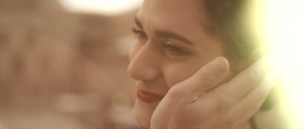
Our Approach: We built the whole film around texture and light. Close, tactile framing on the material, soft directional light that flattered the surfaces, and a colour palette pulled straight from the Italian sun. We slowed everything down. In luxury, pace is a signal. A film that rushes feels cheap, and a film that lingers feels considered.
Art direction carried the meaning. Every prop, surface, and shadow had to belong to the same world. We kept the set deliberately sparse so nothing competed with the product, then let warmth and movement bring the emotion the brief asked for. The idea of a kiss lived in the framing, the closeness, and the unhurried rhythm rather than anything literal.
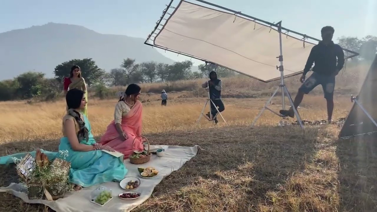
Behind the Scenes: We shot the hero detail at the end of the day on purpose, to catch the last warm light through a window. Then the clouds came in. Rather than fake it with a lamp, we held the set, waited twenty minutes, and the light broke through for a few minutes right at sunset. That short window gave us the warmest, softest frames in the entire film. Patience did what equipment could not.
The grade took longer than the shoot. We tested a dozen looks before we found the one that felt Italian rather than just golden. Too warm and it turned into a holiday advert. Too neutral and the romance drained out of it. The final grade sits in a narrow band that took real discipline to hold across every shot.
The Edit: We cut slowly and let each frame settle. Long holds, gentle transitions, and a soundtrack that breathed with the images. The product appears the way a memory does, in glimpses, always present and never forced.
Outcome: We delivered a campaign film that felt like the brand rather than describing it. The label used it as the centrepiece of the campaign, and the unhurried, sensory style gave the product a sense of worth that no feature list could. In luxury, how something feels is the whole pitch, and the film made it feel right.
What We Delivered: We handed over a finished campaign film, a tightly held grade tuned to feel Italian rather than simply golden, and shorter cutdowns for social and digital placements. The art direction was built as a complete world, so the same mood carried into the brand's stills and store screens without a single jarring note.